Mailjet Brand Refresh Rollout
Mailjet Brand Refresh Rollout
Sinch rebranded, and each sub-brand got its own identity, designed through a collaboration with the agency Oh!Snap. I led the rollout for Mailjet: bringing the new brand to life across every surface, from the homepage to 100+ graphics.
Sinch rebranded, and each sub-brand got its own identity, designed through a collaboration with the agency Oh!Snap. I led the rollout for Mailjet: bringing the new brand to life across every surface, from the homepage to 100+ graphics.

Bringing a new brand to life across an entire product, while keeping everything running.
Sinch set out to unify its sub-brands, which had drifted apart over the years. The new brand system was created by Oh!Snap, a US agency, who built a fresh identity for Sinch's sub-brands, with their own variations, including Mailjet. My job here was to roll that brand out across Sinch Mailjet: taking the system the agency designed and turning it into real, working assets across every surface.


Some of the Illustrations I created for the Homepage Ticker based on the new brand
A new face
The new brand shares some DNA with the old one, like the signature violet, but nearly everything else is new: refreshed colors, new typography, a new logo, and a new Bento grid system. Rolling it out meant updating type, color, and logo everywhere they appeared.
The Bento system
The standout new tool is Bento, a modular grid system shared across all Sinch brands, with each sub-brand getting its own flavor. It gives Mailjet a flexible, consistent way to build layouts that finally feels like a real system. It also helps communicating Mailjet's values as being the playful, energetic Sinch sub-brand.

Imagery, finally
The refresh also gave Mailjet two things it didn't have anymore: an illustration style and a photography direction. Photography now comes in two modes. Studio-style portraits on clean, colorful backgrounds, and "real moments," people in context, reading a message on the subway or working at a desk. After a year with nothing to reach for, having real imagery to work with changed everything.
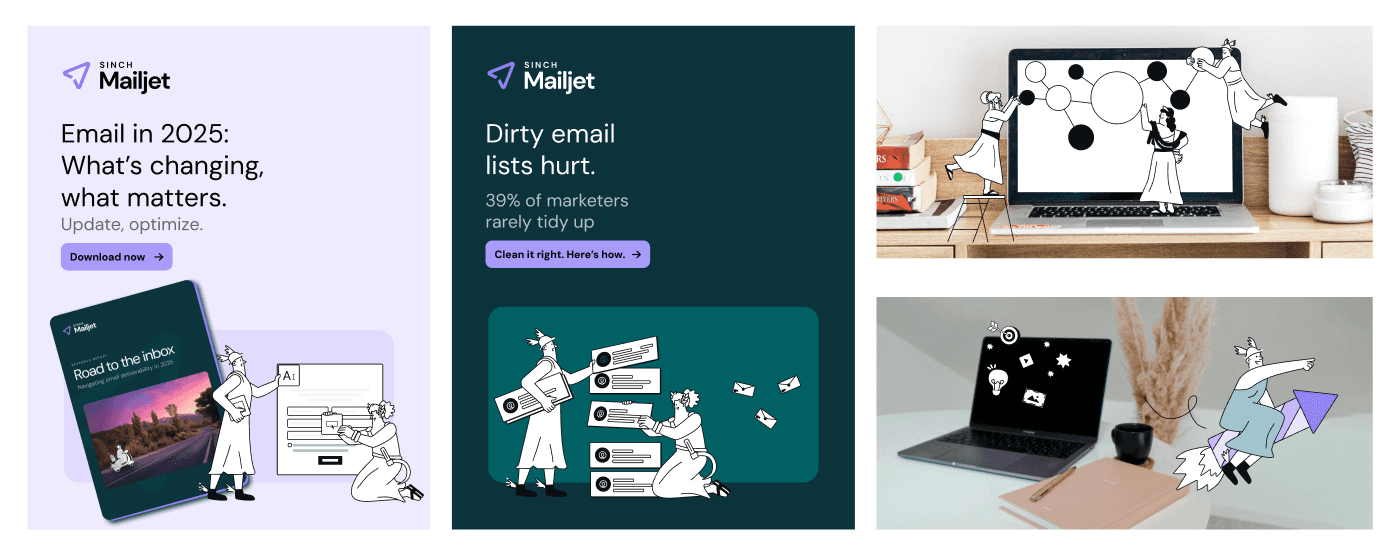
100+ simplified UIs
Beyond brand illustration, Mailjet relies on simplified UI graphics (SUIs): pared-down views of the product used to explain features. There were over a hundred of them, nearly all carrying the old logo, colors, or type. None needed a full redesign, but every one needed adapting. At that volume, it became one of the largest pieces of the rollout.

The homepage
The agency designed an early version of the Mailjet homepage. I took that foundation and reworked it into what's live today, shaping the final look of the page. It's the most public face of the new brand, and you can see it now at mailjet.com.
Visit the live website
Before: a brand in limbo
For most of 2025, Mailjet lived in a strange in-between. Our oldest brand signature, a cast of Greek god illustrations that had appeared across everything Mailjet made, was being phased out. Nothing arrived to replace it. We had no illustration style and no photography direction, so any time a project needed an image, we built something from scratch with no system to lean on. The refresh was heavily anticipated, and for good reason.
old style of Mailjet imagery, phased out by early 2025
Rolling it out
A refresh of this scale is not a single handoff. It meant coordinating closely with Oh!Snap, the Sinch Brand Team, internal developers, and the digital ops team, while keeping every other piece of design work moving in parallel. Replacing a brand across a live product is slow, detailed, and rarely glamorous, but it's the work that makes a new identity actually stick.
Bringing a new brand to life across an entire product, while keeping everything running.
Sinch set out to unify its sub-brands, which had drifted apart over the years. The new brand system was created by Oh!Snap, a US agency, who built a fresh identity for Sinch's sub-brands, with their own variations, including Mailjet. My job here was to roll that brand out across Sinch Mailjet: taking the system the agency designed and turning it into real, working assets across every surface.
Some of the Illustrations I created for the Homepage Ticker based on the new brand
A new face
The new brand shares some DNA with the old one, like the signature violet, but nearly everything else is new: refreshed colors, new typography, a new logo, and a new Bento grid system. Rolling it out meant updating type, color, and logo everywhere they appeared.
The Bento system
The standout new tool is Bento, a modular grid system shared across all Sinch brands, with each sub-brand getting its own flavor. It gives Mailjet a flexible, consistent way to build layouts that finally feels like a real system. It also helps communicating Mailjet's values as being the playful, energetic Sinch sub-brand.
Imagery, finally
The refresh also gave Mailjet two things it didn't have anymore: an illustration style and a photography direction. Photography now comes in two modes. Studio-style portraits on clean, colorful backgrounds, and "real moments," people in context, reading a message on the subway or working at a desk. After a year with nothing to reach for, having real imagery to work with changed everything.
100+ simplified UIs
Beyond brand illustration, Mailjet relies on simplified UI graphics (SUIs): pared-down views of the product used to explain features. There were over a hundred of them, nearly all carrying the old logo, colors, or type. None needed a full redesign, but every one needed adapting. At that volume, it became one of the largest pieces of the rollout.
The homepage
The agency designed an early version of the Mailjet homepage. I took that foundation and reworked it into what's live today, shaping the final look of the page. It's the most public face of the new brand, and you can see it now at mailjet.com.
Visit the live website
Before: a brand in limbo
For most of 2025, Mailjet lived in a strange in-between. Our oldest brand signature, a cast of Greek god illustrations that had appeared across everything Mailjet made, was being phased out. Nothing arrived to replace it. We had no illustration style and no photography direction, so any time a project needed an image, we built something from scratch with no system to lean on. The refresh was heavily anticipated, and for good reason.
old style of Mailjet imagery, phased out by early 2025
Rolling it out
A refresh of this scale is not a single handoff. It meant coordinating closely with Oh!Snap, the Sinch Brand Team, internal developers, and the digital ops team, while keeping every other piece of design work moving in parallel. Replacing a brand across a live product is slow, detailed, and rarely glamorous, but it's the work that makes a new identity actually stick.
©2026 JULIM
Go Back To Top
©2026 JULIM
Go Back To Top